I have a standard code for ggplot2 which I use to make line graphs, scatter plots, and histograms.
For lines or scatters:
p<- ggplot(x, aes(x=Year, y=Rank, colour=Uni, group=Uni)) #colour lines by variable Uni #group Uni labelled variables in the same line
Then:
p + #you get an error if not for this step
geom_line(size=1.2) +
geom_point(data=QS[QS[,2]==”2013″,]) +
geom_text(data=QS[QS[,2]==”2013″&QS[,1]!=”Princeton”,],aes(label=paste(paste(Rank,”.”,sep=””),Uni)),hjust=-0.2)+
ylim(17,0.5) +
scale_x_continuous(limit=c(2004,2014),breaks=seq(2004,2014,1)) +
theme(legend.position=”none”) +
ggtitle(“QS University Rankings 2008-2013”) +
theme(plot.title=element_text(size=rel(1.5))) +
theme_bw() +
theme(panel.grid.major=element_blank(), panel.grid.minor=element_blank()) +
geom_text(aes(label=country),size=6,vjust=-1) +
annotate(“text”,x=2011,y=16.5,label=”Abbas Keshvani”)
For a bar chart:
ggplot(Dist, aes(x=B,y=C,fill=A)) + #stacked bars, column A contains stacks
geom_bar(stat=”identity”, width=0.9) +

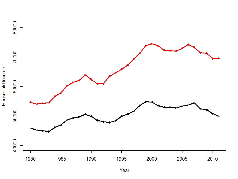
Looks like base R graphics (not a bad thing). Never was a fan of ggplot2 style graphics. Base or Lattice look much better IMO. Of course Lattice doesn’t have the marketing hype…
I agree! I tweaked the ggplot commands to make the graphics look more base. For instance, Im not a fan of the grid for line graphs (grid is for plots IMO) so I disabled it via the theme() line